
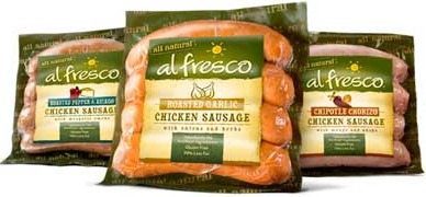
My friends have a weekly poker game. At said poker game, everyone brings a little something to share foodwise with the group. Alice brought some fancy sausage to the last poker game for grilling purposes:
In back of the package was a QR code. As someone who regularly scans these codes only to be sent to a not-mobile friendly website, I was surprised that after this scan, I was sent to a mobile friendly website clearly designed that way on purpose:

(The Groupon ad on the bottom is courtesy of my QR code reader-which is normally what you get when you download a free app. How do I know it was the app and not the website? I put the address in my mobile browser and the ad didn’t show up. Mystery solved.)
So far so good, sausage company.
Of course when you design a mobile site, you design it for scrolling…And so scroll I did:

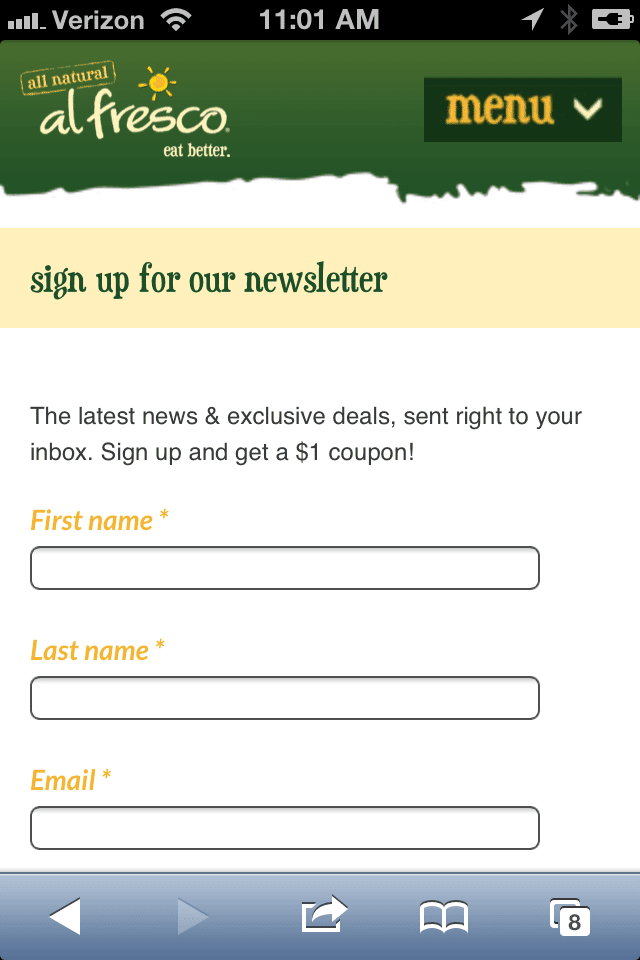
Like most good websites, Al Fresco has taken the opportunity for this company to grab your email address, in exchange for a $1 off coupon. This amount ($1-$2) is about what someone typically pays for a Google or Facebook ad click (around this amount anyway) and clearly an email address is more valuable than than a single click to most companies.
When you click ‘Sign Up Now’, it links to a mobile friendly form:
As you see, each thing you link to on your mobile website is one more thing you have to make mobile friendly. Signup form, links to recipes, photo galleries… everything you link to is something that not only makes your site more dynamic but also is a potential thing that can go wrong, mobile speaking.
So, if you are shorter on time or money, be enthusiastic about your mobile site but be realistic too. First off, it’s literally 1/10th the screen size of a typical computer so it can’t do everything your full-sized website does. And secondly making elements mobile friendly takes time.
The one issue I found on Al Fresco’s mobile template was one part that didn’t work:
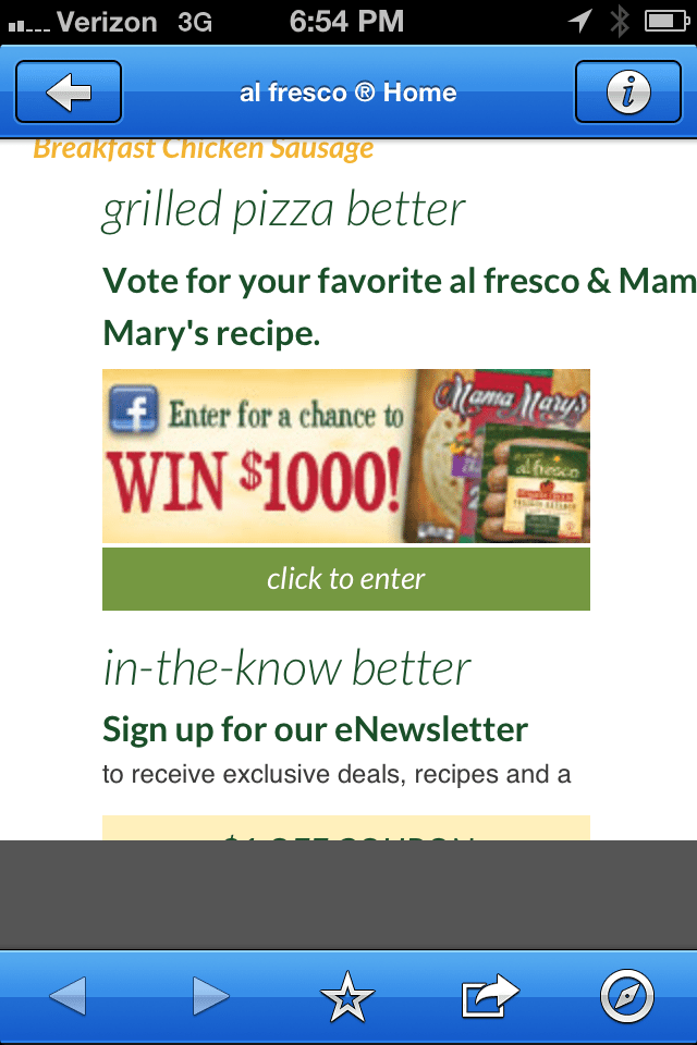
When I click to enter the $1000 contest on the ‘click to enter’ button, I get a 404 error. Bummer, I could use $1000!
Like I said, this is one of the better mobile websites I’ve run into so hats off to Al Fresco on making the QR code actually go to something interesting.
So what can we learn from our sausage-y friends about mobile websites?
- Think about what your mobile users care about. I cook from my iPhone all the time so recipes are great. I won’t, however, read the company’s blog from my phone, which is why they don’t link to it. They aren’t trying to do everything their regular website does, just the most important to mobile users things.
- Make everything you link to mobile friendly. The importance for mobile doesn’t just apply to the items on that main page but anything you link to from that page. Otherwise you look like an inconsiderate jerk who didn’t think the idea completely through.
- Test often. Sometimes there can be an issue you don’t catch, especially if you are updating the page often, or have more than one person updating said page.
Whether you sell sausage or the grill we cooked them on, it’s important to think of your mobile user. So take a look at your website from a mobile perspective at least once a month to see what your mobile customers see.
Want to know more about mobile websites? Here’s a helpful article: https://breakingeveninc.com/mobile-site-options/